
When designing a website, one of the most important decisions you’ll make is how to ensure your site looks great and works well on all devices. With the wide variety of devices—ranging from smartphones and tablets to laptops and desktops—it’s critical to create a site that provides a seamless user experience across all platforms. This is where responsive design and adaptive design come into play. But how do you choose between the two?
In this article, we’ll break down the differences between responsive and adaptive design, and help you decide which is best for your website.
What is Responsive Design?
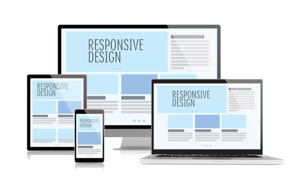
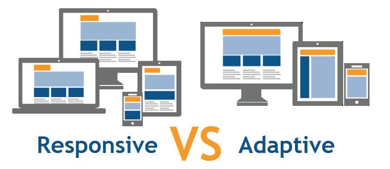
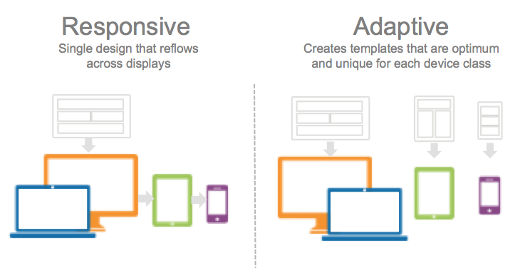
Responsive web design (RWD) is a design approach where the layout of your website adjusts automatically to fit the screen size, regardless of the device being used. In essence, a responsive website is built to “respond” to the environment it’s being viewed in, whether that’s a large desktop screen or a small smartphone.
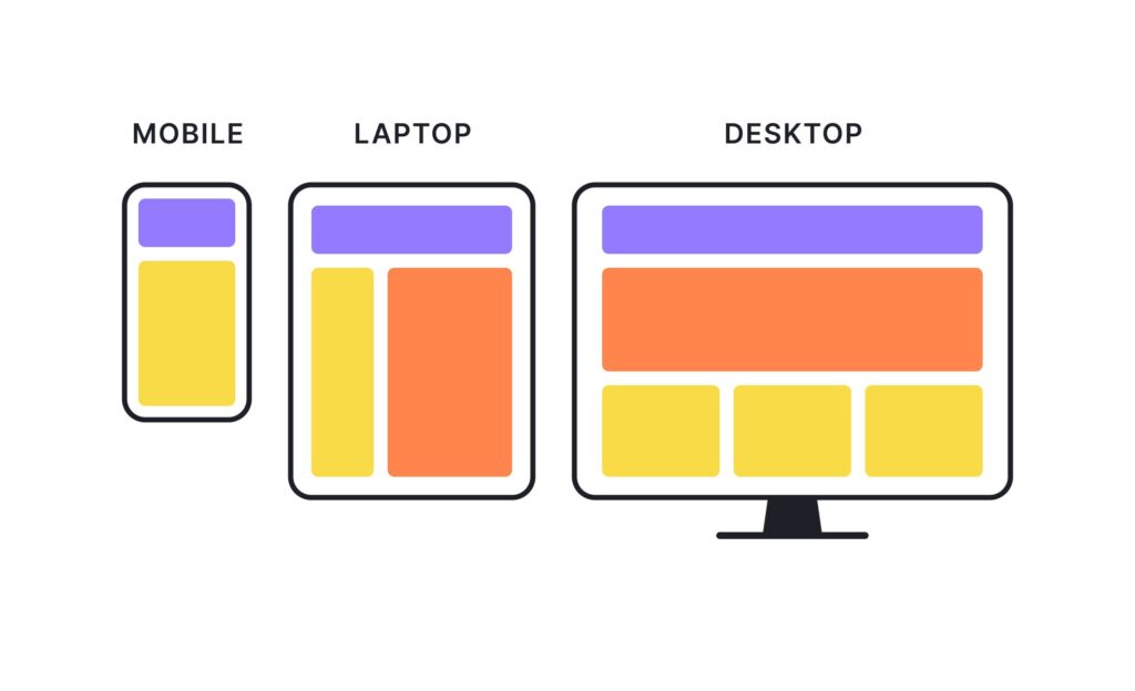
A key feature of responsive design is the use of fluid grids and media queries. These tools enable the website’s content, images, and elements to resize dynamically depending on the screen resolution. As a result, a single set of code works across all devices, providing a smooth experience for users without needing separate layouts for different screen sizes.
Advantages of Responsive Design:
- Cost-Effective: One website for all devices, eliminating the need for separate desktop and mobile versions.
- Seamless User Experience: Consistency in layout and functionality across all screen sizes.
- SEO-Friendly: Google prefers responsive websites because they use a single URL for all devices, improving SEO rankings.
Disadvantages of Responsive Design:
- Slower Load Times: Because the same code is used across all devices, it can sometimes lead to larger file sizes, affecting load times, especially on mobile networks.
- Complexity: Designing and testing a responsive site can be more complex since it needs to adapt to a wide range of screen sizes and resolutions.
What is Adaptive Design?
Adaptive web design (AWD), on the other hand, takes a more tailored approach. Instead of using a single flexible layout, adaptive design detects the device being used and serves a specifically designed layout for that device. Adaptive websites typically feature multiple fixed layouts, each optimized for specific screen widths (e.g., one layout for mobile devices, one for tablets, and one for desktop computers).
Unlike responsive design, which resizes elements dynamically, adaptive design loads a different version of the website depending on the user’s screen size or device type. This allows designers to craft unique layouts and experiences tailored to each device.
Advantages of Adaptive Design:
- Optimized Experience: Tailored layouts for specific devices, which can provide a better user experience by optimizing content placement.
- Performance: With separate designs for different devices, adaptive design can potentially improve page load speeds as it only loads the necessary elements for the user’s device.
- Control: More control over how your site will appear on different devices, ensuring that users get a version that is specifically designed for their screen.
Disadvantages of Adaptive Design:
- Higher Costs: Building and maintaining multiple layouts for different devices can be resource-intensive, requiring more time and effort in both design and development.
- Potential SEO Issues: Because adaptive design uses different URLs for different device versions, there’s a risk of fragmentation of content, which could affect SEO. Careful planning is required to ensure search engines index the right pages.
- Device Fragmentation: The multitude of device sizes and resolutions can make adaptive design challenging to keep up to date, especially as new devices are released.
Responsive vs. Adaptive Design: Which Is Best for Your Website?
Now that we know the strengths and weaknesses of each approach, it’s time to evaluate which one is best for your website. Here’s a comparison to help you decide:
| Criteria | Responsive Design | Adaptive Design |
|---|---|---|
| User Experience | Fluid and consistent experience across all devices. | Tailored experience for specific devices. |
| SEO | Google-friendly with a single URL for all devices. | Potential SEO challenges with multiple URLs. |
| Maintenance | Easier to maintain due to a single codebase. | Requires maintenance of multiple layouts for different devices. |
| Performance | Can be slower on mobile due to larger file sizes. | Potential for faster load times as only necessary assets load. |
| Cost | More cost-effective (single design for all devices). | More expensive due to multiple layouts and device testing. |
| Customization | Less customization for individual devices. | Highly customizable for different screen sizes. |
When to Use Responsive Design?
- Smaller Budget: If you’re working with a limited budget and need a website that works on a variety of devices, responsive design is your best option. It’s a cost-effective approach that works across all screen sizes without requiring separate layouts.
- Simple Website: If your website doesn’t have complex functionality or heavy content (such as e-commerce stores), responsive design should be sufficient to meet your needs.
When to Use Adaptive Design?
- Need for Performance: If you’re building a website that requires optimized performance on specific devices (such as a mobile-heavy audience), adaptive design may be the way to go. It can allow you to load device-specific content and improve load times.
- Tailored User Experience: If you want full control over how your site looks and feels on different devices, and are willing to invest in the extra effort for multiple layouts, adaptive design may be the better choice.
Conclusion
Both responsive design and adaptive design have their own strengths and weaknesses, and the best choice depends on your website’s goals, audience, and budget.
- If you want a simpler, cost-effective solution with a consistent experience across devices, responsive design is the way to go.
- If you need more customization for specific devices and are willing to invest more in development, adaptive design might be the better option.
Whichever approach you choose, the key is to prioritize the user experience and ensure that your website is designed to be easily accessible and enjoyable for your audience on all platforms.

